Navigation and User Flow Basics
Good navigation is invisible — visitors find what they need without thinking. We’ll show you how to structure it properly.

Why Navigation Matters More Than You Think
Your website could have the best content in the world, but if visitors can’t find it, nobody benefits. Navigation is the map that guides people through your site — and the best maps don’t call attention to themselves.
Think about walking into a store. You don’t want to think about where things are. The layout just makes sense. Good web navigation works exactly the same way. You’re designing a path, not a puzzle.

The Core Principles of Navigation Design
Good navigation follows a few core rules. First, it’s consistent — users expect the main menu in the same place every time they scroll up. Second, it’s clear. Your menu items should tell people exactly what they’ll find, not use clever language that makes them guess.
Third, it’s minimal. You don’t need 20 menu items. Most websites work fine with 5-7 main navigation items. When you cram in too many, people get overwhelmed and just leave.
And finally, it’s scannable. People don’t read your navigation carefully — they scan it quickly. Your menu should be visual enough that someone can understand the structure in about 2 seconds flat.

How to Structure Your Navigation
Main Navigation
Your primary menu should appear at the top or side. It’s the first thing people see. Keep it to your most important sections. Don’t hide crucial information behind submenus when it could be a main item.
Hierarchy Matters
Create clear visual hierarchy. Main items should be more prominent than sub-items. Use size, color, and spacing to show what’s important. A visitor should understand the structure without reading labels.
Mobile Considerations
On mobile, the hamburger menu works, but test it. Make sure your mobile navigation is just as usable as desktop. People shouldn’t need to tap through 4 levels of menus to reach common pages.
Contextual Navigation
Beyond the main menu, add navigation within your content. Breadcrumbs show where people are. “Related posts” links help them discover more. Footer links provide backup navigation.

Understanding User Flow
User flow is the path a visitor takes through your site. It’s the journey from landing page to goal — whether that’s reading an article, filling out a contact form, or making a purchase.
Map out your user flows before you build. Where does someone land? What do they see first? What’s the next logical step? You’ll often discover that your first instinct wasn’t actually the clearest path.
The best user flows have minimal friction. Three clicks to reach a goal is good. Five clicks and people start abandoning. It’s not that they’re impatient — it’s that they assume what they’re looking for doesn’t exist if they can’t find it quickly.
Practical Tips for Your First Navigation Design
Test with Real People
Don’t assume your navigation makes sense. Ask 5-10 people to use your site and watch where they struggle. You’ll spot problems you never would have seen alone.
Keep It Consistent
The main menu should look and behave the same on every page. Visitors shouldn’t have to relearn your navigation as they move through your site.
Show the Active Page
Always highlight which page visitors are currently on. This simple visual cue prevents confusion about where they are in your site structure.
Make Links Obvious
Links should look like links. Underlines or color changes work. Don’t make people guess which text is clickable and which isn’t.
Wrapping Up
Navigation and user flow aren’t complicated concepts. You’re just thinking like your visitor. What would make their journey smooth? Where would they expect to find things? What’s the simplest path to their goal?
Start by mapping out 3-5 common user flows on your site. Trace the path from entry to goal. Then design your navigation to support those paths. You don’t need fancy animations or clever interactions — you need clarity and consistency.
Good navigation feels obvious. That’s how you know you’ve done it right.
Ready to Build Your Site?
Navigation is just one piece of good web design. Explore our complete Web Design Fundamentals course to learn everything from layout to color theory.
Explore More TopicsAbout This Article
This article provides educational information about web design principles and best practices. Every website is different, and what works best for yours will depend on your specific goals, audience, and content. These guidelines are starting points, not strict rules. Test your navigation with real users, observe their behavior, and adjust based on actual feedback rather than assumptions. Web design is both science and art — the principles here form the foundation, but your creative judgment matters just as much.
Related Articles
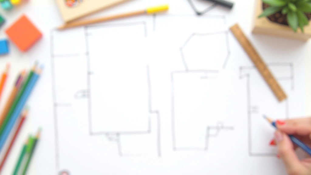
Wireframing Your First Website Layout
Learn why sketching before building saves time. We’ll walk through creating a basic wireframe and why it matters…

Typography and Color: Getting It Right
How to pick fonts and colors that work together. Includes practical tips for readability and visual harmony…

Mobile-First Design: Why It Matters
Mobile visitors make up most of your audience now. Learn why designing for phones first creates better experiences…