
Typography and Color: Getting It Right
How to pick fonts and colors that work together. Includes practical tips for readability and visual hierarchy.
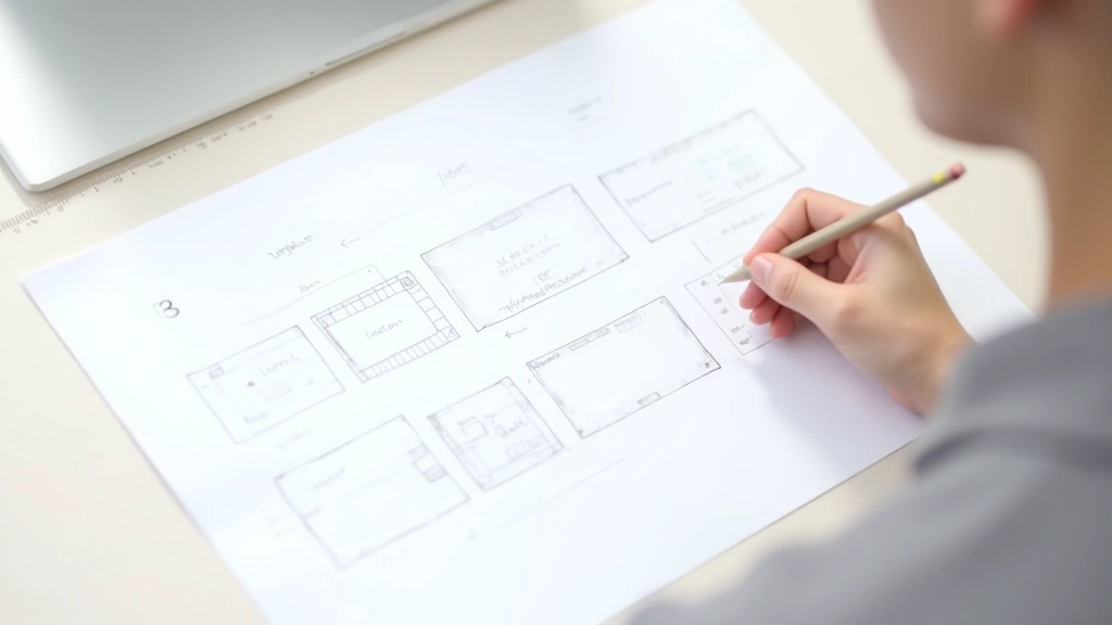
Read ArticleLearn why sketching before building saves time. We’ll walk through creating a basic wireframe for a simple business site.

Most people want to jump straight into design. They’ve got colors in mind, maybe some ideas about fonts, and they’re ready to start building. But here’s the thing — you’ll save yourself hours of frustration by sketching first.
A wireframe is just a simple black-and-white layout sketch. No colors, no fancy fonts, no images. Just boxes representing where things go. It’s low-pressure, quick to change, and it forces you to think about structure before you get attached to how things look.
Think of it like building a house. You wouldn’t start painting walls before the foundation is solid, right? Wireframing is your foundation.

Here’s how to create your first wireframe without overthinking it.
Start simple. For a basic business website, you’ll need a header with logo and navigation, a hero section with headline, maybe a few sections for services or features, and a footer. Write it down. This takes 5 minutes.
Grab a pencil and paper. Draw rough rectangles for each section. Don’t worry about being precise — just get the proportions right. Is the hero section taller than the footer? Make it look that way. Are three sections side-by-side? Sketch them that way. This phase takes about 10-15 minutes.
Inside your rectangles, write what goes there. “Logo + Nav”, “Hero headline”, “3-column feature cards”, “Contact form”. You’re not designing yet — you’re clarifying what each area contains and how much space it gets.
Step back. Does the layout flow logically? Can you imagine visiting this site? Is there enough visual breathing room? If something feels off, erase and redraw. This isn’t precious — it’s supposed to be rough.
You don’t need to invent something completely original. Some layouts work because they’re predictable — visitors know where to find things. Here are the patterns you’ll see everywhere because they actually work:
You’re not copying other sites — you’re using proven structures. That’s actually smart design. Once you understand these patterns, you can adapt them to your specific content.

Paper and pencil work fine. But if you want to go digital, here are the straightforward options.
Seriously. Fastest way to get ideas out. Grab a blank sheet or even graph paper. Sketch boxes, write labels. No learning curve. Erase if needed. Total time investment: zero.
Cloud-based design tool with a free tier. Drag rectangles, add text, save to the cloud. Great for sharing wireframes with others. Slight learning curve but worth it if you’re doing multiple projects.
Purpose-built for wireframing. Simple interface, drag-and-drop elements. You’ll get up to speed in 10 minutes. Free version works for most small projects.
If you want to keep it simple, create a grid in Sheets. Merge cells to represent sections. Not pretty, but it works and you’re already familiar with it.
Let’s say you’re building a site for a local fitness trainer. Here’s what the wireframe would look like, top to bottom:
Header (80px) — Logo on left, three menu items (Home, Services, Contact) on right. Simple. Clear.
Hero Section (500px) — Big headline “Get Fit With Expert Coaching” centered, subheading below, call-to-action button. Background would be an image later, but in the wireframe it’s just a light gray box.
Services Section (600px) — “What I Offer” heading, three equal columns below: Personal Training, Group Classes, Online Programs. Each has a small icon placeholder and short description. This took up about 25% of the total page height.
Testimonials (400px) — Three client testimonials in boxes. Simple quote marks, client name, job title. Alternate background color to break things up visually.
Footer (200px) — Contact info on left, social media links on right, copyright at the very bottom. That’s it.
Total: About 1700px tall. Not massive, but substantial enough that it doesn’t feel sparse. The proportions are balanced. You can already imagine scrolling through this site.
Learn from what others get wrong.
Your wireframe doesn’t need to be perfect. Rough sketches are fine. If you’re spending more than 30 minutes on one page, you’re probably overthinking.
Your wireframe should work on phones too. Do your three-column section stack to one column on mobile? Plan this now, not later. Saves major redesign work.
Beginners pack too much into every inch. Your wireframe should show breathing room between sections. Not everything needs to be visible at once.
Users should always know where they are and how to get somewhere else. Your wireframe should show the navigation clearly on every page view.
If your header is 80px on one page, keep it 80px on all pages. Same button sizes, same spacing. Consistency feels intentional and professional.
Show your wireframe to someone. Not a designer — just a regular person. Do they understand the layout? Can they imagine using this site? Their honest reaction is gold.
Wireframing isn’t complicated. It’s actually the simplest part of web design because you’re not worrying about colors, fonts, or images yet. You’re just solving the structure problem: what goes where?
Spend 30 minutes sketching. Grab paper or open Figma. Map out your header, hero section, a few content areas, and a footer. That’s enough to get started. You’ll be surprised how much clarity you gain from just getting it on paper.
This step saves you hours later because you’re building from a solid plan, not guessing as you go. That’s the real power of wireframing — it’s not about making it pretty, it’s about making it work.

This article is educational material designed to help you understand web design fundamentals. The techniques and approaches described here are general best practices in web design. Every project is unique, and your specific needs may vary based on your audience, content, and business goals. We recommend consulting with experienced designers or design professionals for complex projects. This content is informational only and not a substitute for professional design consultation.